History and development
The Equal Earth project emerged in response to a real‑world cartographic controversy surrounding alternative world maps. In March 2017, the Boston Public Schools adopted the Gall–Peters projection to show the relative sizes of continents more fairly. This decision sparked critique about distortion in polar regions and the search for an equal‑area alternative that also offered compelling visual appeal. Šavrič, Jenny, and Patterson sought such a solution and, after evaluating existing projections, created Equal Earth to combine respect for area with a more aesthetically pleasing presentation than earlier options.
In the broader context of global map advocacy, the Correct the Map campaign—led by Africa No Filter and Speak Up Africa and supported by the African Union and Caribbean Community—advanced efforts to promote equal‑area representations in education and policy discussions. The campaign emphasizes wider adoption of equal‑area projections, including Equal Earth, across international organizations and educational materials.
What the Equal Earth projection does well
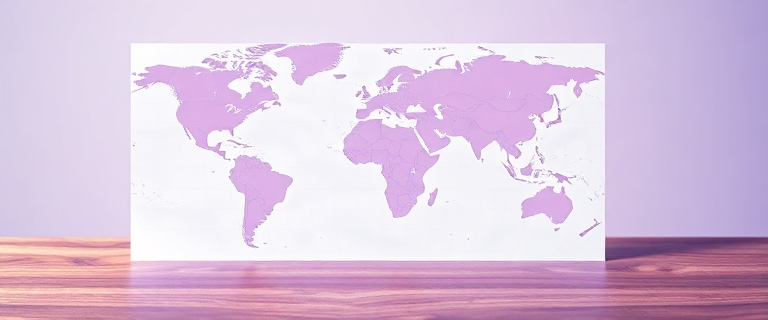
Equal Earth is designed to preserve the relative area of every region on the globe, which helps readers understand geographic scale more accurately than traditional Mercator displays. The projection’s curved edges convey the globe’s spherical shape, while straight parallels enable straightforward comparisons of latitude. Meridians are spaced evenly along any given latitude, a feature that aids in interpreting position and distance. Importantly, the projection is built to be simple to implement and computationally efficient, which makes it attractive for GIS workflows and interactive mapping applications.
Historically, the Equal Earth design draws on visual strategies similar to the Robinson projection, aiming to strike a balance between geographical fidelity and legibility. The creators explicitly intended Equal Earth to function as a practical equal‑area alternative for situations where such a map must be used, while acknowledging that equal‑area projections are not universal remedies for all cartographic needs.
Notable uses and ecosystem support include ongoing work with major GIS platforms. OpenStreetMap‑based maps can be produced in Equal Earth, and vector tiles on an Equal Earth Greenwich grid can be addressed using a Web Mercator framework. Mapbox supports the equalearth projection, and Esri tools provide support for Equal Earth, including configurable central meridians in recent ArcGIS Pro releases. As of September 2026, Mapbox restricts the central meridian to Greenwich (the Prime Meridian), while Esri tools allow custom central meridians in some configurations.
How Equal Earth compares to other projections
From a high‑level standpoint, Equal Earth sits among a family of equal‑area projections intended to correct size distortions seen in Mercator. It differs from Mercator, which preserves angles (conformal) but greatly distorts area near the poles, often making Greenland appear as large as Africa even though Africa is roughly 14 times larger in reality. In contrast, Equal Earth preserves area more faithfully while sacrificing some geographical exactness in shape, a trade‑off common to many equal‑area designs.
A widely used compromise in global mapping is the Winkel Tripel, which balances size and shape. National Geographic and many educational institutions have historically used Winkel Tripel for world maps. In contrast, Equal Earth emphasizes accurate area representation with a visual style inspired by familiar graticules, offering a distinct alternative when accurate area is the priority.
For readers who want a quick, practical comparison, consider this distilled contrast: Equal Earth vs. Mercator emphasizes true relative sizes and more balanced landmasses, whereas Mercator prioritizes straight navigation lines at the expense of size accuracy near the poles. The Peters and Goode Homolosine projections each address some of these issues in different ways, but Equal Earth remains a modern option designed specifically to be aesthetically appealing while keeping area fidelity in focus.
In practice, the choice of projection depends on the goal. If the objective is to compare country sizes for educational or policy purposes, Equal Earth offers a compelling and legible alternative to Mercator, with transparency about its limitations (more on usefulness and caveats below).
One concrete statistic helps illustrate why Equal Earth matters for perception: on the Mercator projection, Greenland appears roughly as large as Africa, but Africa’s true land area is about 14 times larger than Greenland’s, and Greenland actually covers only about 7% of Africa’s land area. This distortion is part of why Equal Earth’s equal‑area approach is considered valuable for global comparisons.
Practical implementation in GIS and display environments
Equal Earth can be implemented in modern GIS workflows and online mapping platforms. OpenStreetMap data can be rendered with the Equal Earth projection, and vector tiles can be produced specifically for an Equal Earth Greenwich grid to align with Web Mercator addressing. Mapbox provides support for the equalearth projection, and Esri’s ArcGIS platform supports Equal Earth in ways that enable users to center the map on meridians other than Greenwich in some configurations. However, Mapbox, as of September 2026, fixes the central meridian at Greenwich, which is a practical limitation for Africa‑centric or other region‑centered displays. By contrast, Esri’s tools offer more flexible central meridian options in certain setups, giving users alternative centering capabilities.
NASA’s Goddard Institute for Space Studies (GISS) produced the first known thematic map using Equal Earth, a July 2018 global mean temperature anomaly visualization. This marks a milestone in the early adoption of the projection for scientific communication, illustrating how an equal‑area layout can be informative in climate contexts.
Political and educational context: the UN resolution and related campaigns
On September 4, 2026, the United Nations General Assembly adopted a non‑binding resolution encouraging the broader use of equal‑area projections, including Equal Earth, in education, policy materials, and international communications. The vote tallied 164 in favor, with six abstentions and one vote against—the United States. The abstentions included Estonia, Georgia, Lithuania, Moldova, Serbia, and Ukraine, while Russia supported the resolution. The resolution does not ban the Mercator projection or impose a single global map for UN usage, and it does not create any treaty obligation requiring states to adopt a particular projection. The EU clarified that the resolution neither addresses nor affects sovereignty, borders, or the endorsement of specific websites or maps, underscoring the measure’s neutrality in geopolitical terms.
Beyond the vote itself, the campaign landscape includes the Correct the Map initiative, launched by Africa No Filter and Speak Up Africa, which calls for wider adoption of the Equal Earth projection. By August 2025, the campaign had backing from the African Union and the Caribbean Community, reflecting a broader civil society movement to shift global cartographic norms toward more equitable representations. In practice, this movement seeks to influence educational curriculums, media maps, and official data products to include Equal Earth as a standard or preferred alternative to legacy projections, especially in regions whose size has historically been distorted in traditional maps.
In terms of political nuance, the UN vote and the accompanying public discourse highlighted how map projections intersect with sovereignty narratives. Ukraine abstained over concerns about how Crimea is depicted on Equal Earth maps, and Russia’s stance in favor of the resolution was noted alongside debates about border representations. The European Union’s explanation of vote emphasized that the resolution does not resolve questions of sovereignty or endorse any particular map—an important distinction for readers seeking to understand the resolution’s scope.
Finally, the policy and health implications of projection choices have drawn attention from cross‑disciplinary studies. A 2026 Lancet Global Health article by Teufel, Kocher, and Bulstra discusses how how scientists visualize geographic data can influence public understanding of disease spread and resource allocation, underscoring that map projection decisions carry real‑world consequences beyond aesthetics or classroom graphs.
Benefits, drawbacks, and when to choose Equal Earth
Like all equal‑area projections, Equal Earth makes deliberate trade‑offs. Its most prominent strength is faithful area representation, which reduces the misperception that near‑polar regions are disproportionately large. The projection’s family resemblance to familiar graticule layouts helps readers interpret location, while preserving areas makes it a powerful tool for comparative geography, policy discussions, and climate visualizations. A notable caveat is that, as with other equal‑area projections, some continental shapes are distorted compared with a purely aesthetic view of the globe. The creators themselves caution that equal‑area projections are not panaceas—choosing Equal Earth should be motivated by a strong priority for area accuracy and fair representation, rather than assuming it will be ideal in every context.
For practical decisions: use Equal Earth when your goal is to communicate relative sizes accurately across regions, particularly when the audience includes policymakers, educators, or researchers who rely on geographic comparisons. If preserving shape or accurate navigation distances is paramount, other projections may be more appropriate. When centering on a particular region (for example, Africa), be mindful of the projection’s centering options and platform capabilities: Mapbox currently centers at Greenwich by default, while Esri tools generally permit more flexible centering in certain workflows.
In short, Equal Earth is a carefully crafted, modern equal‑area projection designed to deliver fair size representation with a visually intuitive layout. It is not a universal replacement for every mapping task, but it is a credible and increasingly influential option for contexts where accurate area representation matters most—and it is supported by a growing ecosystem of mapping tools and educational campaigns.
A practical decision framework (summary)
When you should consider Equal Earth: your primary aim is to convey comparative sizes of countries and continents with credible area fidelity, especially in education, journalism, or policy analysis. Be mindful of platform limitations (for example, Mapbox’s Greenwich center as of late 2026) and consider Esri’s options for alternative centroids if your use case requires centered views away from Greenwich. Remember that Equal Earth is not a panacea for all cartographic needs; if you must preserve shape perfectly or require precise navigation distances, explore other projections. Finally, recognize that the UN‑level rhetoric around the 2026 resolution is non‑binding and framed to encourage broader use rather than mandate a single official map.
See also and references
Key sources for Equal Earth include the publication and subsequent materials, along with documentation from major GIS platforms that describe support for the projection. Notable items cited in discussions of the projection and its adoption include:
- The 2018 International Journal of Geographical Information Science article introducing Equal Earth by Šavrič, Jenny, and Patterson.
- NASA GISS’s July 2018 global mean temperature anomaly map using Equal Earth (the first known thematic map with the projection).
- Mapbox documentation detailing projections and central meridian considerations.
- Esri ArcGIS Pro documentation and related materials describing Equal Earth support and parameterization.
- United Nations General Assembly resolution A/80/L.104 (“Correct the Map”) and the related EU explanation of vote clarifications.
- The Correct the Map campaign and its backers (Africa No Filter, Speak Up Africa, African Union, Caribbean Community), including campaigning materials and petitions.
- Lancet Global Health article by Teufel, Kocher, and Bulstra (2026) on how how scientists visualize the world matters for public health perceptions and policy decisions.